Cushions

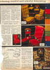
Crushed velvet cushions on a colonial style rocking chair. Looks like something that would be in a retirement home for pimps.
I wonder how one becomes a pimp? And why it was not a career option suggested by my school guidance counselor?

Why did they bother to Scotchgardź the bottom cushion design? I think a few stains would have helped. The chair skirts just don't look right.


A lot of famous architects would turn to furniture design, usually chairs, as an alternate creative outlet. These chairs would have beautiful and sleek lines. I once saw a museum exhibit of chairs designed by famous architects and the chairs were quite a visual feast. These chairs were true works of functional art. Not really functional because while they provided a feast for the eyes the chairs barely performed the main function of a chair, which is to support someone in a sitting position. Most of the chairs would hold up a person's weight but they were all very uncomfortable. But they all had dramatic, sleek, clean lines.
All this pointed to some of the failures of Modern Architecture. Dramatic, clean, sleek lines trumped the needs of the humans using the buildings or furniture. It is why a housing project designed by I.M. Pei got trashed by the residents. Dramatic, sleek, clean lines that nobody could stand living in.
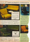
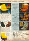
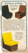
The furniture in the above pictures were probably designed by not so great architects. The lines are not as dramatic but the seating is as equally uncomfortable. Some of the copy even makes a point in saying that it is made of fiberboard, not wood or hardboard. Ugly, uncomfortable and made of high grade cardboard. I think the chairs in the photo on the far right are the perfect metaphor for the 1970's. Ugly, cheaply made, overpriced and uncomfortable.
Introduction | Important Looks | Knit Pants Set | The Walking Suit | Nightwear | Winnie the Pooh Collection | Children's Shop | Susie and Sally | Cheap Boots | Little Sears | Child Models of the Damned | Baby Accessories from Hell | Boy's Clothes | Put On Shop | Lemon Frog Shop | Young Pacesetters | Ladies Wear | Gracious Woman | Junior Bazaar | Accessories | Attack of the Clones | Acrylic | Coats | Lingerie | Maternity Shop | At-Home Wear | Ladies Underwear | Luggage | Wigs | Watches | Americana | Fabric | Shoes | King's Road Collection | Men's Store | Sleep Wear | Men's Underwear | Celebrity Models | Men's Coats | Alternate Dimensions | Fun Stuff | Child Safety | Sports, Leisure and Exercise | Bicycle | Hank Hill | Toilets | Kitchen | Household | Shelving Center | Wallpaper | ? | Color TV | Buck Owens | Lamps and Wall Decorations | Dinnerware | Nursery of Death | Furniture I | Furniture II | Furniture III | Funky! | Furniture in Real Life | Bathrooms | Bedding | The Great Put-Downs | Two Tales | Rugs I | Rugs II | Curtains, Bedding and Other Disasters | Draperies I | Draperies II | Cushions | Draperies III | Slip Covers | Bedspreads I | Bedspreads II | Bedspreads III | History | Awards and Press | Links
